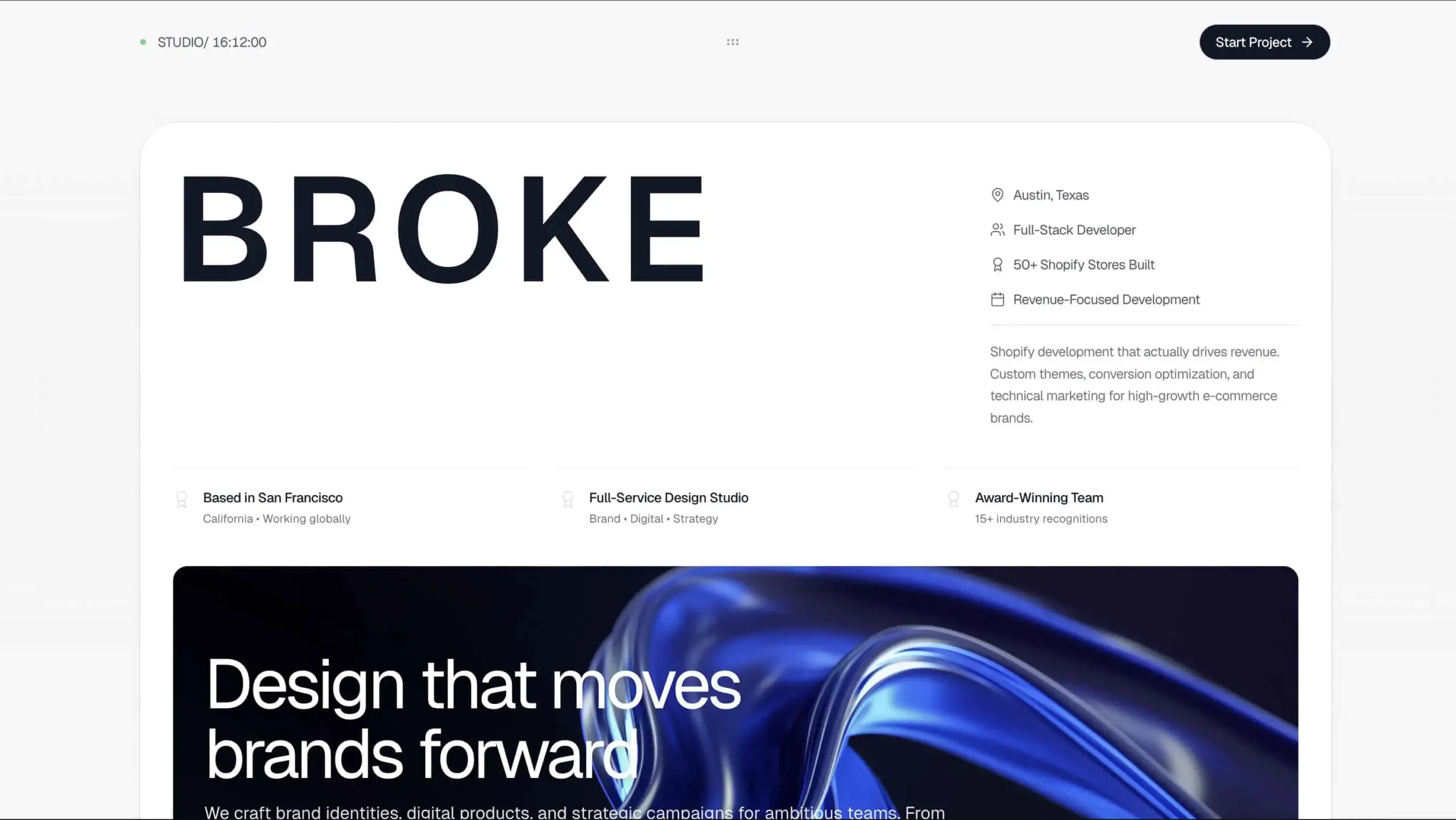
Light Studio Creative Portfolio
Bright, minimalist portfolio template for creative professionals and design studios emphasizing clean aesthetics, generous whitespace, and light color palettes. Read More
Client
Internal Project
Technologies
UI/UX Design, Brand Identity, Web Design, Illustration, Typography, Motion Design
Date
October 27, 2025
Project Overview
Light Studio is a bright, airy portfolio template designed for creative professionals who want their work to breathe. Built on principles of minimalism and generous whitespace, this template puts the focus squarely on the creative work itself. The light color palette creates an approachable, professional atmosphere perfect for designers, illustrators, and creative studios.
Key Features
Light & Airy Design System
- Predominantly white backgrounds with subtle off-white variations
- Soft shadows and border treatments (border-gray-200)
- Pastel accent colors for interactive elements
- High-contrast black text for readability
- Generous padding and spacing throughout
Portfolio Grid Showcase
Masonry Layout
- Pinterest-style staggered grid
- Variable height project cards
- Hover interactions revealing project details
- Smooth image loading with blur-up technique
- Category filtering with smooth transitions
Project Detail PagesnEach project includes:
- Large hero image
- Project brief and objectives
- Design process documentation
- Final deliverables showcase
- Client testimonial (if applicable)
- Related projects suggestions
Creative Sections
Services Offered
- UI/UX Design
- Brand Identity Development
- Website & App Design
- Illustration & Icon Design
- Typography & Print Design
- Motion Graphics
Presented with:
- Custom iconography
- Hover animations
- Brief descriptions
- Example work links
About & PhilosophynPersonal bio section with:
- Professional headshot
- Design philosophy statement
- Awards and recognition
- Education and credentials
- Studio location
Process TimelinenVisual representation of creative workflow:
- Discovery & Research
- Concept Development
- Design Execution
- Refinement & Iteration
- Delivery & Support
Technical Implementation
Image-First Architecture
- WebP format with PNG/JPG fallbacks
- Responsive images with srcset
- Lazy loading below the fold
- Blur-up progressive loading
- Optimized for Retina displays
Typography ExcellencenMulti-tier type system:
- Display: For headlines and hero text
- Sans-serif: Body copy (Inter, Satoshi)
- Serif: Accent text (Crimson Pro, Fraunces)
- Monospace: Technical details
Careful attention to:
- Line height (1.6-1.8 for body)
- Letter spacing
- Font weight hierarchy
- Responsive scaling
Smooth Interactions
- Scroll-triggered fade-ins
- Parallax effects on images
- Hover scale on project cards
- Page transitions
- Smooth scrolling navigation
Accessibility
- WCAG 2.1 AA compliant
- Keyboard navigation
- Screen reader optimized
- Focus indicators
- Alt text for all images
Design Philosophy
- Whitespace as Design Element - Space creates breathing room
- Content Hierarchy - Clear visual order guides the eye
- Subtle Interactions - Polish without distraction
- Image Quality - Professional photography and mockups
- Consistent Grid - Mathematical precision in layout
The light aesthetic conveys:
- Clarity: Easy to navigate and understand
- Professionalism: Polished and considered
- Approachability: Friendly and welcoming
- Confidence: Letting work speak for itself
- Modernity: Contemporary design trends
Use Cases
Perfect for:
- Freelance UI/UX designers
- Graphic designers and illustrators
- Small creative studios (2-5 person teams)
- Brand designers and identity specialists
- Web designers focusing on aesthetics
- Art directors building personal brands
Technical Stack
- Framework: Static HTML/CSS with optional JavaScript
- Styling: Tailwind CSS with custom light theme
- Grid: CSS Grid and Flexbox
- Images: Cloudinary or Imgix for optimization
- Animation: Framer Motion or GSAP (minimal)
- Icons: Custom SVG icon set
- Fonts: Google Fonts or self-hosted web fonts
- Forms: Netlify Forms or Formspree
Conversion Goals
This portfolio converts through:
- Visual Impact - Stunning work is the main CTA
- Easy Navigation - Finding specific work types is effortless
- Professional Presentation - Builds confidence in quality
- Clear Contact - Multiple touch points without being pushy
- Personality - Humanizing the designer behind the work
Strategic CTA placement:
- Newsletter signup for staying connected
Project Presentation Best Practices
Mockup Standards
- High-quality device mockups (Figma, Sketch)
- Contextual environment shots
- Multiple angles and perspectives
- Consistent mockup style across projects
- Real content, not lorem ipsum
Case Study Structure
- Brief: Client needs and constraints
- Challenge: Specific problems to solve
- Solution: Design approach and rationale
- Process: Sketches, iterations, decisions
- Result: Final work and outcomes
Image Guidelines
- Minimum 2000px wide for hero images
- 16:9 or 4:3 aspect ratios
- Compressed but high quality
- Consistent color grading
- Watermark-free
Strategic Positioning
This portfolio positions the designer as:
- Detail-Oriented: Every pixel considered
- Client-Focused: Work presented in business context
- Process-Driven: Systematic approach to design
- Quality-Conscious: High standards evident throughout
- Collaborative: Open to partnerships and projects
The light aesthetic differentiates from common dark portfolios while maintaining professional credibility. It's particularly effective for designers targeting:
- Startups and tech companies
- Lifestyle and wellness brands
- E-commerce and consumer products
- Publishing and editorial
- Education and non-profits
Customization Options
Color SchemesnWhile maintaining light foundation:
- Warm (beige, cream, soft orange accents)
- Cool (light blue, gray, mint accents)
- Neutral (pure white, black, gray scale)
- Pastel (light pink, lavender, sage)
Layout Variations
- Traditional grid (3-4 columns)
- Masonry (Pinterest-style)
- Horizontal scroll
- Single column (mobile-first)
- Featured + grid hybrid
The result is a versatile, timeless portfolio template that never goes out of style. The focus remains on the work, while the design system provides structure and professionalism that clients expect from creative professionals.